The graphs of five-year running averages of hemispheric temperature in the figure below are generally similar.If you assume that most of the temperature rise has been due to increased CO₂ generated by industry that was primarily in the northern hemisphere,do the northern and southern hemispheres appear to have separate air circulation,with very little or no mixing of air between them? 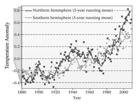
A) yes
B) no
Correct Answer:
Verified
Q38: On what time scale does albedo change?
A)
Q39: The warmest global temperatures since the end
Q40: The discovery that the amount of solar
Q41: It is generally believed that humans began
Q42: A blogger writes that global warming is
Q44: If Charles Keeling had chosen to carefully
Q45: Which two features on the figure below
Q46: Looking at the figure below,how much has
Q47: According to the graph below,when did ocean
Q48: Why would discovery of a large,previously unknown,ongoing
Unlock this Answer For Free Now!
View this answer and more for free by performing one of the following actions

Scan the QR code to install the App and get 2 free unlocks

Unlock quizzes for free by uploading documents