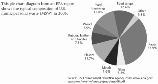
-The pie chart above shows the typical content of municipal solid waste (MSW) in the U.S. This chart represents an average amount, based on the year 2006. Think about the three largest categories in this chart, and then think about your own MSW. Are your largest categories the same as shown here? Are they different? Why? What can you do to cut down on the three largest categories of MSW that you personally generate?
Correct Answer:
Verified
View Answer
Unlock this answer now
Get Access to more Verified Answers free of charge
Q90: Considering the priorities suggested by the U.S.
Q91: Considering the priorities suggested by the U.S.
Q92: Considering the priorities suggested by the U.S.
Q93: Considering the priorities suggested by the U.S.
Q95: Briefly explain the advantages and disadvantages of
Q96: Explain to a friend what the term
Q97: List the three key principles environmental scientists
Q98: Considering the priorities suggested by the U.S.
Q99: Considering the priorities suggested by the U.S.
Q100: Considering the priorities suggested by the U.S.
Unlock this Answer For Free Now!
View this answer and more for free by performing one of the following actions

Scan the QR code to install the App and get 2 free unlocks

Unlock quizzes for free by uploading documents