The figure below shows the demand and supply curves in the market for elementary education. Figure 13.1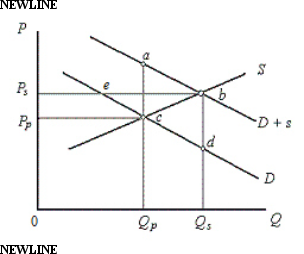 In the figure,
D: Private demand curve for elementary education
D + s: Demand curve which includes public benefits
S: Supply curve of education
Price and Quantity have been taken on vertical and horizontal axes respectively.
-In Figure 13.1,D represents the private demand for education,and D+s represents the demand including the public benefits of education.According to the figure,the optimal subsidy is equal to:
A) 0Qs -0Qp.
B) 0Ps - 0Pp.
C) Qpa - Qpc.
D) Qsb - Qsd.
E) the distance bc.
Correct Answer:
Verified
Q37: Which of the following is true of
Q38: Overfishing along the coastline of Helsking village
Q39: Overfishing along the coastline of Helsking village
Q40: When the commons are converted into privately
Q41: The figure given below shows the demand
Q44: The figure given below shows the demand
Q45: When the government tries to control pollution
Q46: The Clean Air Act of 1972 required
Q47: The figure given below shows the demand
Q79: ![]()
Unlock this Answer For Free Now!
View this answer and more for free by performing one of the following actions

Scan the QR code to install the App and get 2 free unlocks

Unlock quizzes for free by uploading documents