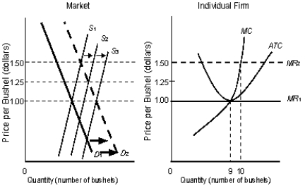
The following figure shows equilibrium at the industry and firm level.Figure 10.6
 In the figure,
S1, S2, S3 are the market supply curves.D1 and D2 are the market demand curves.MC is the marginal cost curve of the firm.MR1 and MR2 are the marginal revenue curves of the firm.ATC is the average-total-cost curve of the firm.
-Graphically, producer surplus is the area:
A) above the equilibrium price and below the demand curve.
B) below the equilibrium price and below the supply curve.
C) above the supply curve and below the demand curve.
D) below the equilibrium price and above the supply curve.
E) below the equilibrium price and above the demand curve.
Correct Answer:
Verified
Q99: The following figure shows equilibrium at the
Q100: The figure given below shows the revenue
Q101: The figure given below shows the aggregate
Q102: The figure given below shows the aggregate
Q103: The figure given below shows the aggregate
Q105: The figure given below shows the aggregate
Q106: The figure given below shows the aggregate
Q107: The figure given below shows the aggregate
Q108: The figure given below shows the aggregate
Q109: The figure given below shows the aggregate
Unlock this Answer For Free Now!
View this answer and more for free by performing one of the following actions

Scan the QR code to install the App and get 2 free unlocks

Unlock quizzes for free by uploading documents