Figure 22-3. The left-hand graph shows a short-run aggregate-supply (SRAS) curve and two aggregate-demand (AD) curves. On the left-hand diagram, Y represents output and on the right-hand diagram, U represents the unemployment rate. 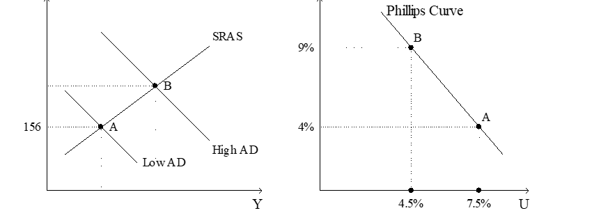
-Refer to Figure 22-3. Assume the figure charts possible outcomes for the year 2018. In 2018, the economy is at point B on the left-hand graph, which corresponds to point B on the right-hand graph. Also, point A on the left-hand graph corresponds to A on the right-hand graph. The price level in the year 2018 is
A) 155.56.
B) 159.00.
C) 163.50.
D) 170.04.
Correct Answer:
Verified
Q1: In 1968,economist Milton Friedman published a paper
Q60: Suppose that the money supply increases. In
Q63: Figure 22-2
Use the pair of diagrams below
Q66: Figure 22-3. The left-hand graph shows a
Q67: Figure 22-3. The left-hand graph shows a
Q69: When aggregate demand shifts left along the
Q70: Figure 22-2
Use the pair of diagrams below
Q77: In 2007 and 2008 households and firms
Q79: According to the short-run Phillips curve,inflation
A)and unemployment
Q125: From 2008-2009 the Federal Reserve created a
Unlock this Answer For Free Now!
View this answer and more for free by performing one of the following actions

Scan the QR code to install the App and get 2 free unlocks

Unlock quizzes for free by uploading documents