Figure 3.3 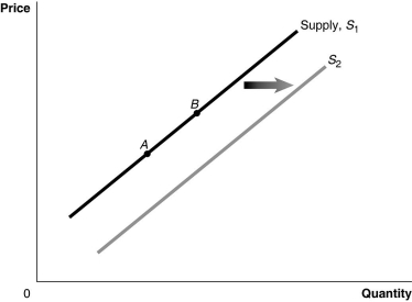 Alt text for Figure 3.3: In figure 3.3, a graph of the effect of an increase in the price of inputs on the supply curve.
Long description for Figure 3.3: The x-axis is labelled, Quantity, and the y-axis is labelled, Price.Curve Supply, S1, is a straight line which slopes up from the bottom left corner to the top right corner.2 points, A and B, are marked in the middle of curve S1.Curve S2 follows the same slope as curve S1, but is plotted to the right.A right pointing arrow indicates the change from curve S1 to curve S2.
-Refer to Figure 3.3.An increase in the price of substitutes in production would be represented by a movement from
A) A to B.
B) B to A.
C) S1 to S2.
D) S2 to S1.
Correct Answer:
Verified
Q64: Cole was discussing the market for cocoa
Q79: If consumers believe the price of hybrid
Q85: What is the difference between an "increase
Q99: If in the market for oranges the
Q107: If Canada bans the importation of beluga
Q109: Once a good is considered inferior, it
Q114: Explain the law of demand.
Unlock this Answer For Free Now!
View this answer and more for free by performing one of the following actions

Scan the QR code to install the App and get 2 free unlocks

Unlock quizzes for free by uploading documents