Figure 3.9 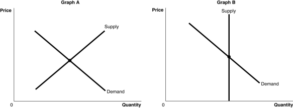 Alt text for Figure 3.9a: In figure 3.9a, a graph plotting intersecting supply and demand curves represents one of the two markets for original Michelangelo sculptures and Ray Ban sunglasses.
Long description for Figure 3.9a: The x-axis is labelled, Quantity, and the y-axis is labelled, Price.Curve Supply is a straight line which slopes up from the bottom left corner to the top right corner.Curve Demand is a straight line which slopes down from the top left corner to the bottom right corner.The 2 curves intersect at their respective midpoints.
Alt text for Figure 3.9b: In figure 3.9b, a graph plotting intersecting supply and demand curves represents one of the two markets for original Michelangelo sculptures and Ray Ban sunglasses.
Long description for Figure 3.9b: The x-axis is labelled, Quantity, and the y-axis is labelled, Price.Curve Demand is a straight line which slopes down from the top left corner to the bottom right corner.Curve Supply is a straight vertical line which begins from the midpoint of the x axis.The 2 curves intersect at their respective midpoints.
-Refer to Figure 3.9.The figure above shows the supply and demand curves for two markets: the market for original Michelangelo sculptures and the market for Ray Ban sunglasses.Which graph most likely represents which market?
A) Graph B represents the market for original Michelangelo sculptures and Graph A represents the market for Ray Ban sunglasses.
B) Graph A represents the market for original Michelangelo sculptures and Graph B represents the market for Ray Ban sunglasses.
C) Graph A represents both the market for original Michelangelo sculptures and for Ray Ban sunglasses.
D) Graph B represents both the market for original Michelangelo sculptures and for Ray Ban sunglasses.
Correct Answer:
Verified

