Figure 3.11 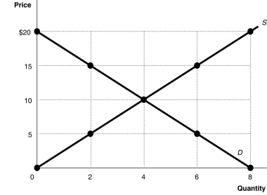 Alt text for Figure 3.11: In figure 3.11, a graph plotting intersecting supply and demand curves illustrates how supply and demand function in competitive markets.
Long description for Figure 3.11: The x-axis is labelled, Quantity, and is marked from 0 to 8 in increments of 2.The y-axis is labelled, Price, and is marked from 0 to 20 dollars in increments of 5.Curve D is a straight line which slopes down from the top left corner to the bottom right corner.Curve S is a straight line which begins in the bottom left corner and slopes up to the top right corner.The equilibrium of the 2 curves is marked at (4,10) .2 points plotted on the demand curve to the left of the equilibrium are (0,20) and (2,15) .2 points plotted on the demand curve to the right of the equilibrium are (6,5) and (8,0) .2 points plotted on the supply curve to the right of the equilibrium are (6,15) and (8,20) .2 points plotted on the supply curve to the left of the equilibrium are (2,5) and (0,0) .
-Refer to Figure 3.11.In a free market such as that depicted above, a shortage is eliminated by
A) a price increase, increasing the supply and decreasing the demand.
B) a price decrease, decreasing the supply and increasing the demand.
C) a price decrease, decreasing the quantity supplied and increasing the quantity demanded.
D) a price increase, increasing the quantity supplied and decreasing the quantity demanded.
Correct Answer:
Verified
Q146: Which of the following describes a characteristic
Q158: Market equilibrium occurs where the quantity supplied
Q163: Assume that the hourly price for the
Unlock this Answer For Free Now!
View this answer and more for free by performing one of the following actions

Scan the QR code to install the App and get 2 free unlocks

Unlock quizzes for free by uploading documents