Figure 7.3 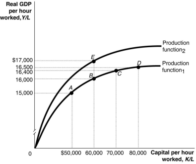 Alt text for Figure 7.3: In figure 7.3, a graph, comparing capital per hour worked and real GDP per hour worked.
Long description for Figure 7.3: The x-axis is labelled, capital per hour worked, K/L.The y-axis is labelled, real GDP per hour worked, Y/L.2 concave curves originating from 0 at the vertex are shown.5 points A ($50000, $15000) , B ($60000, $16000) , C ($70000, $16400) , D ($80000, $16500) , and E ($60000, $17000) are plotted.The curve labelled Production function 1, passes through points A, B, C, and D.The curve labelled Production function 2, passes through point E.These 5 points are connected to their respective coordinates on the x and y-axis with dotted lines.
-Refer to Figure 7.3. A large group of new workers entering the labour force is shown in the figure above by a movement from
A) C to B.
B) A to B.
C) B to E.
D) E to B.
E) C to D.
Correct Answer:
Verified
Q101: If an outflow of workers leaves a
Q102: An increase in _ shifts the production
Q103: In the long run, a country will
Q104: A small economy increased its capital per
Q105: The former Soviet Union consistently increased the
Q107: The per-worker production function shows the relationship
Unlock this Answer For Free Now!
View this answer and more for free by performing one of the following actions

Scan the QR code to install the App and get 2 free unlocks

Unlock quizzes for free by uploading documents