Figure 9.3 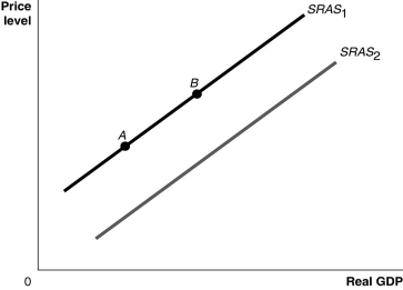 Alt text for Figure 9.3: In figure 9.3, a graph comparing real GDP and price level.
Long description for Figure 9.3: The x-axis is labelled, real GDP, with 0 at the vertex, and the y-axis is labelled, price level.2 lines are shown; SRAS1 and SRAS2.Line SRAS1 begins a little above the vertex and slopes up to the top right corner.Line SRAS2 follows the same slope as line SRAS1, but is plotted to the right.Points A and B are plotted on line SRAS1.Point A is near the left end of the line and point B is near the center of the line.
-Refer to Figure 9.3.Ceteris paribus, an increase in the price level would be represented by a movement from
A) SRAS1 to SRAS2.
B) SRAS2 to SRAS1.
C) point A to point B.
D) point B to point A.
Correct Answer:
Verified
Q67: An increase in exports decreases aggregate demand.
Q78: What is potential GDP?
A)It is the level
Q79: The federal government lowered income taxes for
Q81: Hurricane Katrina destroyed oil and natural gas
Q82: The long-run aggregate supply curve will shift
Q84: Changes in the price level
A)increase the level
Q85: Which of the following would cause the
Q86: If full-employment GDP is equal to $1.9
Q87: Suppose a developing country receives more machinery
Q88: The invention of the cotton gin ushered
Unlock this Answer For Free Now!
View this answer and more for free by performing one of the following actions

Scan the QR code to install the App and get 2 free unlocks

Unlock quizzes for free by uploading documents