Figure 13.11 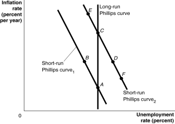 Alt text for Figure 13.11: In figure 13.11, a graph of the Phillips curve.
Long description for Figure 13.11: The x-axis is labelled, unemployment rate percent, and the y-axis is labelled, inflation rate percent per year.A straight line labelled, short-run Philips Curve 1, begins at the top left corner and slopes down to the bottom center.A straight line labelled, short-run Philips Curve 2, follows the same slope as Curve 1, but is plotted to the right.A straight line labelled, long-run Philips Curve, is perpendicular to the x-axis, and intersects the short-run Philips Curve 1, at point A on the bottom end of both lines.Point B is plotted half way along the short-run Philips Curve 1.Long-run Philips Curve, intersects the short-run Philips Curve 2, at point C in the top half of both lines.Point D is plotted more than half-way along short-run Philips Curve 2.Points E and F are plotted close to the left and right ends, respectively, of the short-run Philips Curve 2.
-Refer to Figure 13.11.A supply shock, such as rising oil prices, would be depicted as a movement from ________.
A) A to D to C
B) C to B to A
C) C to D to A
D) C to E to B
E) A to B to C
Correct Answer:
Verified
Q184: Real business cycle models argue that fluctuations
Q190: What does it mean to say that
Q200: Figure 13.8 Q201: Figure 13.11 Q202: A reduction in the rate of inflation Q203: In order to promote price stability as Q205: Over the past two decades, whenever changes Q206: During a time when the inflation rate Q207: Figure 13.11 Q209: The increases in oil prices in 1974 Unlock this Answer For Free Now! View this answer and more for free by performing one of the following actions Scan the QR code to install the App and get 2 free unlocks Unlock quizzes for free by uploading documents![]()
![]()
![]()

