Figure 14.3 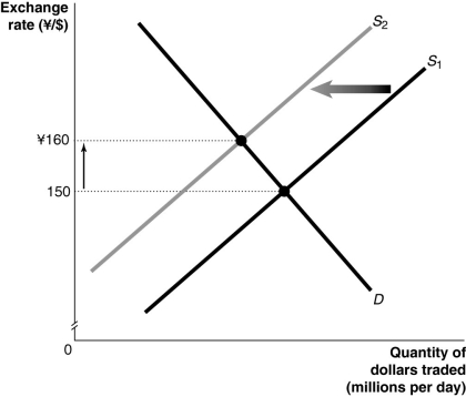 Alt text for Figure 14.3: In figure 14.3, a graph illustrates the quantity of dollars traded against the exchange rate.
Long description for Figure 14.3: The x-axis is labelled, quantity of dollars traded in millions per day, and the y-axis is labelled, exchange rate, Japanese yen against Canadian dollars, with the values 150 and 160 yen marked.2 straight line supply curves slope up from the bottom left corner to the top right corner.Supply curve D is a straight line which slopes down from the top left corner to the bottom right corner.Supply curves, S1 and S2, intersect curve D.The intersection point of S1 and D is connected to its corresponding y-axis value of 150 with a dotted line.The intersection point of S2 and D is connected to its corresponding y-axis value of 160 with a dotted line.An up pointing arrow indicates the difference between the 2 y-axis values.A left pointing arrow indicates the change from curve S1 to curve S2.
-Refer to Figure 14.3.Consider the market for Canadian dollars against the Japanese yen shown above.An event that could have caused the changes shown in the graph would be
A) an increase in Canadian real income.
B) speculators expecting the dollar to depreciate in value in the near future.
C) an economic expansion in Canada.
D) a decrease in Japanese interest rates.
E) the imposition of a tax on foreign investment in Canada.
Correct Answer:
Verified
Q134: Currency traders expect the Canadian dollar to
Q135: Ceteris paribus, a rise in interest rates
Q136: Explain and show graphically how an increase
Q137: Currency traders expect the value of the
Q138: When the market value of the Canadian
Q140: How does a decrease in value of
Q141: Figure 14.4 Q142: If the exchange rate changes from $0.05 Q143: Canada's strong economic performance in the wake Q144: Figure 14.4 ![]()
![]()
Unlock this Answer For Free Now!
View this answer and more for free by performing one of the following actions

Scan the QR code to install the App and get 2 free unlocks

Unlock quizzes for free by uploading documents