Figure 15.10 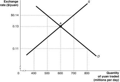 Alt text for Figure 15.10: In figure 15.10, a graph illustrates the quantity of yuan traded against the exchange rate.
Long description for Figure 15.10: The x-axis is labelled, quantity of yuan traded in millions per day.The y-axis is labelled, exchange rate, Canadian dollar against the yuan.Supply curve S, is a straight line which slopes up from the bottom left corner to the top right corner.Demand curve D, is a straight line which slopes down from the top left corner to the bottom right corner.The curves intersect at point A, (600, 0.13) .Point A, and unmarked points (800, 0.11) , (500, $0.14) , (700, $0.14) , and (400, 0.11) are all connected to their corresponding values on the x and y-axes with dotted lines.
-Refer to Figure 15.10.Suppose the pegged exchange rate is $0.14/yuan and Canadian consumers increase their demand for Chinese products.Using the figure above, this would
A) increase the surplus of Chinese yuan.
B) decrease the surplus of Chinese yuan.
C) decrease the shortage of Chinese yuan.
D) increase the shortage of Chinese yuan.
E) increase the quantity of yuan supplied at the pegged rate.
Correct Answer:
Verified
Q174: A currency pegged at a value above
Unlock this Answer For Free Now!
View this answer and more for free by performing one of the following actions

Scan the QR code to install the App and get 2 free unlocks

Unlock quizzes for free by uploading documents