This graph demonstrates the domestic demand and supply for a good,as well as a quota and the world price for that good. 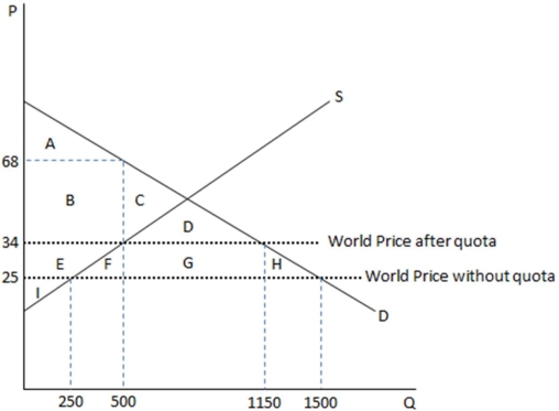
According to the graph shown,once this economy decides to restrict its free trade,area G represents:
A) quota rents.
B) government tax revenues.
C) deadweight loss.
D) transferred surplus.
Correct Answer:
Verified
Q124: This graph demonstrates the domestic demand and
Q125: This graph demonstrates the domestic demand and
Q126: The great Franco-American cheese war of 2009
Q127: The World Trade Organization (WTO)is an international
Q130: Import standards on specific countries:
A)are less common
Q131: This graph demonstrates the domestic demand and
Q132: This graph demonstrates the domestic demand and
Q133: Every government's set of policies used to
Q134: The effect of quotas is:
A)to drive up
Q139: Blanket standards on imports usually address issues
Unlock this Answer For Free Now!
View this answer and more for free by performing one of the following actions

Scan the QR code to install the App and get 2 free unlocks

Unlock quizzes for free by uploading documents