This graph shows the cost and revenue curves faced by a monopoly. 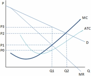
According to the graph,if the perfectly competitive outcome and monopoly outcome are compared,we can see that:
A) the monopoly creates deadweight loss.
B) the perfectly competitive firm would lose money in this industry.
C) the perfectly competitive firm would produce Q1 units.
D) the monopolist would charge P3 and the perfectly competitive firm would charge P1.
Correct Answer:
Verified
Q90: In general,with a monopolist's outcome:
A) consumers lose
Q91: With a monopolist's outcome,producer surplus is:
A) higher
Q98: The monopolist's outcome in the long run
Q99: The monopolist's outcome happens at a:
A)lower quantity
Q100: This graph shows the cost and revenue
Q104: The Sherman Antitrust Act:
A)was actively used by
Q105: The government uses the antitrust laws in
Q106: The government has used the Sherman Act
Q108: The government has used the Sherman Act
Q120: Two antitrust acts actively used by the
Unlock this Answer For Free Now!
View this answer and more for free by performing one of the following actions

Scan the QR code to install the App and get 2 free unlocks

Unlock quizzes for free by uploading documents