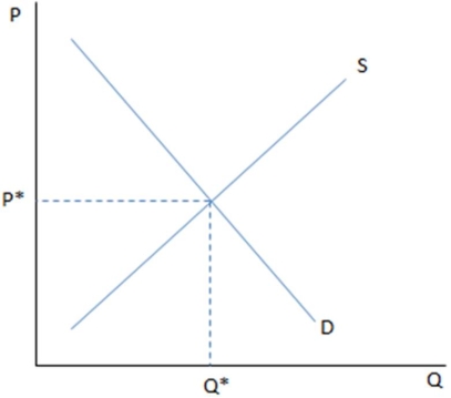
 If the graph shown is displaying a competitive labor market:
A) D would represent the workers' demand for jobs at each wage.
B) Q* would represent the equilibrium wage.
C) P* would represent how many people are employed in the market.
D) Q* would represent the equilibrium number of workers in the market.
Correct Answer:
Verified
Q77: The market labor-supply curve has all of
Q78: If the income effect outweighs the price
Q79: Which of the following would not be
Q80: In general, as wages go up:
A)people are
Q83: In order to see how the labor
Q84: Sadie works at a factory for $15
Q85: In general in the real world labor
Q86: A firm deciding how many hours to
Q87: An individual labor-supply curve represents:
A) a worker's
Q98: We assume an upward-sloping supply curve because:
A)the
Unlock this Answer For Free Now!
View this answer and more for free by performing one of the following actions

Scan the QR code to install the App and get 2 free unlocks

Unlock quizzes for free by uploading documents