The graph below most likely depicts a(n) : 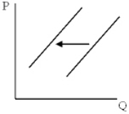
A) supply increase.
B) supply decrease.
C) decrease in demand.
D) increase in demand.
Correct Answer:
Verified
Q57: Exhibit 5-3 Use the following information about
Q59: Exhibit 5-1 The diagram below represents the
Q60: Exhibit 5-2 Q63: Exhibit 5-3 Use the following information about Q64: Exhibit 5-3 Use the following information about Q67: Exhibit 5-3 Use the following information about Q83: Which of the following could be responsible Q91: The invention of machinery that can double Q94: Cold weather in the Midwestern and eastern Q98: Pork from pigs can be used to![]()
Unlock this Answer For Free Now!
View this answer and more for free by performing one of the following actions

Scan the QR code to install the App and get 2 free unlocks

Unlock quizzes for free by uploading documents