The top graph shows the mean temperature over the past 160,000 years as determined from ice-core data.Which of graphs A through D best represents the carbon dioxide concentration in air over the same time period as measured from air bubbles trapped in the ice cores? 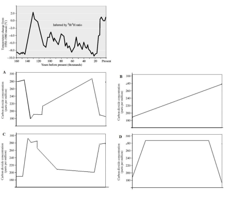
A) Graph A
B) Graph B
C) Graph C
D) Graph D
Correct Answer:
Verified
Q23: Which vibrational mode for carbon dioxide is
Q24: Ethanol (C2H6O)is a common intoxicant and fuel
Q25: Hydrogen gas (H2)is a promising alternative to
Q26: Argon,which comprises almost 1% of the atmosphere,is
Q27: These data show the movement of carbon
Q29: Which occurrences or processes are expected to
Q30: What evidence indicates that the rising atmospheric
Q31: Although coal is a complex mixture of
Q32: What is the coefficient for oxygen in
Q33: What is the effect of infrared energy
Unlock this Answer For Free Now!
View this answer and more for free by performing one of the following actions

Scan the QR code to install the App and get 2 free unlocks

Unlock quizzes for free by uploading documents