The diagram below shows the demand and supply curves in a perfectly competitive market. 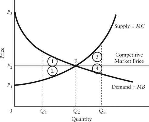 FIGURE 12-5
-Refer to Figure 12-5.If output in this market were Q3,the loss in total economic surplus relative to the competitive equilibrium would be illustrated by area
A) 1.
B) 2.
C) 3.
D) 4.
E) 3 + 4.
Correct Answer:
Verified
Q63: Consider a public utility that is a
Q64: The diagram below shows the demand and
Q65: The diagram below shows the demand and
Q66: In which of the following situations would
Q67: The diagram below shows the demand and
Q69: The diagram below shows the demand and
Q70: The diagram below shows the demand and
Q71: The diagram below shows the demand and
Q72: The diagram below shows the demand and
Q73: Consider a natural monopoly that has declining
Unlock this Answer For Free Now!
View this answer and more for free by performing one of the following actions

Scan the QR code to install the App and get 2 free unlocks

Unlock quizzes for free by uploading documents