The figure below shows the demand and supply curves for pollution abatement. 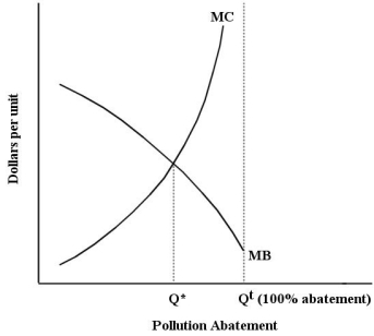 FIGURE 17-3
-Refer to Figure 17-3.What area on the diagram represents the net total benefit of abating pollution by the optimal amount?
A) the area under the MB curve,and above the MC curve,to the left of Q*
B) the area above the MB curve,and below the MC curve,to the right of Q*
C) the area that is below both the MB and MC curves
D) the area that is above both the MB and MC curves
E) the total area below the MB curve,to the left of Q*
Correct Answer:
Verified
Q41: The table below shows the marginal benefit
Q42: The marginal benefit of reducing pollution and
Q43: The table below shows the marginal costs
Q44: The figure below shows the demand and
Q45: The table below shows the marginal costs
Q47: The table below shows the marginal benefit
Q48: Suppose a farm that is polluting an
Q49: The diagram below shows the private and
Q50: The table below shows the marginal benefit
Q51: Suppose a farm that is polluting an
Unlock this Answer For Free Now!
View this answer and more for free by performing one of the following actions

Scan the QR code to install the App and get 2 free unlocks

Unlock quizzes for free by uploading documents