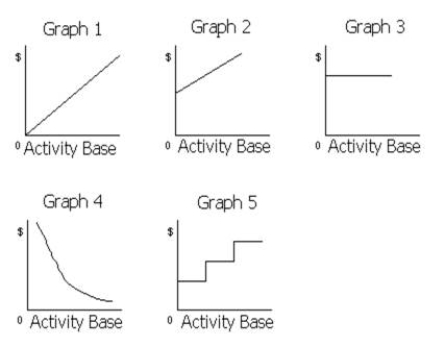
The cost graphs in the illustration below shows various types of cost behaviors.
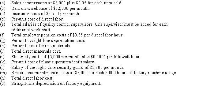
For each of the following costs,identify the cost graph that best describes its cost behavior as the number of units produced and sold increases:
Correct Answer:
Verified
Q121: The point where the sales line and
Q148: Assuming that last year's fixed costs totaled
Q161: Assuming that last year's fixed costs totaled
Q162: The following is a list of various
Q162: Use this information for Rusty Co. to
Q164: Use this information for Timmer Corporation to
Q166: Use this information for Timmer Corporation to
Q167: Given the following information:
Variable cost per unit
Q169: Use this information for Rusty Co. to
Q173: Penny Company sells 25,000 units at $59
Unlock this Answer For Free Now!
View this answer and more for free by performing one of the following actions

Scan the QR code to install the App and get 2 free unlocks

Unlock quizzes for free by uploading documents