Refer to the graph in Infographic 3.What does the figure show? 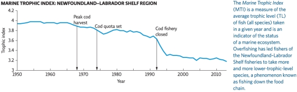
A) fish catch in the 1960s containing mostly lower-trophic-level fish,suggesting that higher-trophic-level fish populations had been depleted
B) the size of fish catch that could be harvested in any given year without decreasing the yield in future years
C) the decrease in the size of the bycatch of different trophic levels over time as fishing technology improved
D) a plot of the Marine Trophic Index from 1950 to 2006,which is a measure of the average trophic level of fish taken in a given year and which is an indicator of the status of a marine ecosystem
E) the annual size of the cod harvest from 1950 to 2006
Correct Answer:
Verified
Q19: Factors that contribute to the collapse of
Q20: A fishery with annual catches below 10%
Q21: Many countries have exclusive economic zones (EEZs).How
Q22: The Magnuson-Stevens Fishery Conservation and Management Act
Q23: _ are discrete regions of ocean that
Q25: Refer to the graph in Infographic 2.Adult
Q26: The Marine Stewardship Council defines a sustainable
Q27: More than half of the world's fisheries
Q28: The Marine Trophic Index has decreased dramatically
Q29: Refer to the Marine Food Pyramid in
Unlock this Answer For Free Now!
View this answer and more for free by performing one of the following actions

Scan the QR code to install the App and get 2 free unlocks

Unlock quizzes for free by uploading documents