Use the following to answer question
Figure: Interpreting Market Shifts 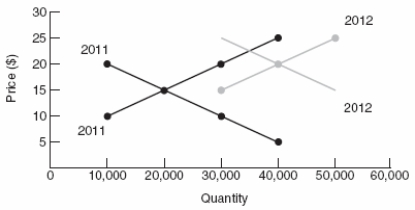
-(Figure: Interpreting Market Shifts) The graph shows how supply and demand increased between the years 2011 and 2012.The final effect is:
A) only price rose.
B) only quantity rose.
C) both price and quantity fell.
D) both price and quantity rose.
Correct Answer:
Verified
Q194: When the supply of coffee decreases and
Q196: When the supply curve shifts out (to
Q197: If the demand curve shifts rightward,the:
A) price
Q198: Which of the following is the MOST
Q203: Prices provide no information other than a
Q204: Suppose in the market for iPhones,the following
Q209: What would be the effect on the
Q239: Markets bring buyers and sellers together to
Q249: If both the supply and the demand
Q292: An increase in supply causes the equilibrium
Unlock this Answer For Free Now!
View this answer and more for free by performing one of the following actions

Scan the QR code to install the App and get 2 free unlocks

Unlock quizzes for free by uploading documents