Figure 35-3.The left-hand graph shows a short-run aggregate-supply (SRAS) curve and two aggregate-demand (AD) curves.On the left-hand diagram,Y represents output and on the right-hand diagram,U represents the unemployment rate. 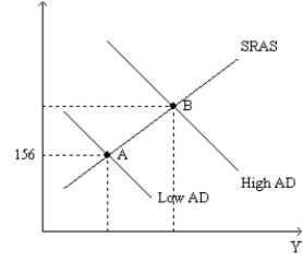
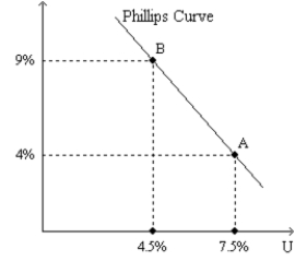
-Refer to Figure 35-3.Assume the figure depicts possible outcomes for the year 2018.In 2018,the economy is at point A on the left-hand graph,which corresponds to point A on the right-hand graph.The price level in the year 2017 was
A) 144.
B) 150.
C) 152.
D) 156.
Correct Answer:
Verified
Q51: Figure 35-1.The left-hand graph shows a short-run
Q52: Figure 35-2
Use the pair of diagrams below
Q53: Figure 35-2
Use the pair of diagrams below
Q54: Figure 35-2
Use the pair of diagrams below
Q55: Figure 35-1.The left-hand graph shows a short-run
Q57: Figure 35-2
Use the pair of diagrams below
Q58: Figure 35-1.The left-hand graph shows a short-run
Q59: Figure 35-1.The left-hand graph shows a short-run
Q60: Figure 35-2
Use the pair of diagrams below
Q61: If more firms chose to pay efficiency
Unlock this Answer For Free Now!
View this answer and more for free by performing one of the following actions

Scan the QR code to install the App and get 2 free unlocks

Unlock quizzes for free by uploading documents