Figure 35-4.The left-hand graph shows a short-run aggregate-supply (SRAS) curve and two aggregate-demand (AD) curves.On the left-hand diagram,the price level is measured on the vertical axis;on the right-hand diagram,the inflation rate is measured on the vertical axis. 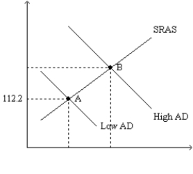
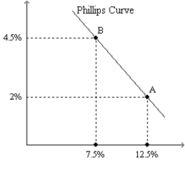
-Refer to Figure 35-4.Assume the figure depicts possible outcomes for the year 2018.In 2018,the economy is at point A on the left-hand graph,which corresponds to point A on the right-hand graph.The price level in the year 2017 was
A) 106.
B) 108.
C) 110.
D) 112.
Correct Answer:
Verified
Q57: Figure 35-2
Use the pair of diagrams below
Q58: Figure 35-1.The left-hand graph shows a short-run
Q59: Figure 35-1.The left-hand graph shows a short-run
Q60: Figure 35-2
Use the pair of diagrams below
Q61: If more firms chose to pay efficiency
Q63: Other things constant,which of the following would
Q64: Which of the following would we not
Q65: As aggregate demand shifts left along the
Q66: If consumption expenditures fall,then in the short
Q125: From 2008-2009 the Federal Reserve created a
Unlock this Answer For Free Now!
View this answer and more for free by performing one of the following actions

Scan the QR code to install the App and get 2 free unlocks

Unlock quizzes for free by uploading documents