The graph below most likely depicts a(n) : 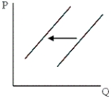
A) supply increase.
B) supply decrease.
C) decrease in demand.
D) increase in demand.
Correct Answer:
Verified
Q74: Which of the following would most likely
Q76: In 1975 a pocket calculator cost more
Q88: Nick is delighted to see that the
Q194: A shift in the supply curve of
Q195: Coca-Cola bottlers increased their prices as the
Q196: A more efficient process for refining oil
Q197: A more efficient means of processing tree
Q201: Assuming that the demand and supply of
Q202: A simultaneous increase in demand and decrease
Q204: Assuming that the demand and supply of
Unlock this Answer For Free Now!
View this answer and more for free by performing one of the following actions

Scan the QR code to install the App and get 2 free unlocks

Unlock quizzes for free by uploading documents