The figure below shows the relationship between cost per unit and the number of firms producing a particular good.The downward shift in the curve from A to B is best explained by a(n) 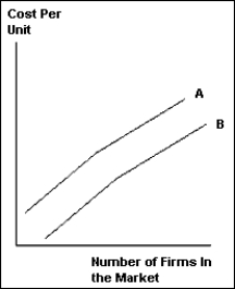
A) increase in the number of firms in the market.
B) increase in market size.
C) decrease in the number of firms in the market.
D) increase in market price.
E) decrease in the market size.
Correct Answer:
Verified
Q85: Trade will tend to equalize the price
Q94: Wages in the developed world with high
Q102: Suppose China and India are both able
Q103: When countries create a free trade area
Q109: Trade in cars between Canada and the
Q110: When the size of the market increases,
Q112: When Canada and the United States permitted
Q114: If price is above average cost, then
Q118: How does trade due to comparative advantage
Q120: What are the gains from trade when
Unlock this Answer For Free Now!
View this answer and more for free by performing one of the following actions

Scan the QR code to install the App and get 2 free unlocks

Unlock quizzes for free by uploading documents