Figure 17-3. The left-hand graph shows a short-run aggregate-supply (SRAS) curve and two aggregate-demand (AD) curves. On the left-hand diagram, Y represents output and on the right-hand diagram, U represents the unemployment rate.
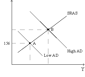
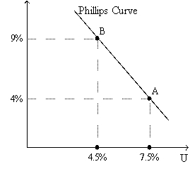
-Refer to Figure 17-3. Assume the figure charts possible outcomes for the year 2018. In 2018, the economy is at point B on the left-hand graph, which corresponds to point B on the right-hand graph. Also, point A on the left-hand graph corresponds to A on the right-hand graph. The price level in the year 2018 is
A) 155.56.
B) 159.00.
C) 163.50.
D) 170.04.
Correct Answer:
Verified
Q9: In the late 1960s,Milton Friedman and Edmund
Q10: In the late 1960s,economist Edmund Phelps published
Q13: Friedman argued that the Fed could use
Q16: By raising aggregate demand more than anticipated,policymakers
A)reduce
Q76: Figure 17-3. The left-hand graph shows a
Q79: Figure 17-2
Use the pair of diagrams below
Q80: Figure 17-2
Use the pair of diagrams below
Q82: In the long run, if the Fed
Q125: From 2008-2009 the Federal Reserve created a
Q133: In 2009, Congress and President Obama approved
Unlock this Answer For Free Now!
View this answer and more for free by performing one of the following actions

Scan the QR code to install the App and get 2 free unlocks

Unlock quizzes for free by uploading documents