-The line chart below shows tomato prices each month from January (month 1) to December last year ($ per pound). By looking at this chart you can see the lowest tomato prices occurred in July. 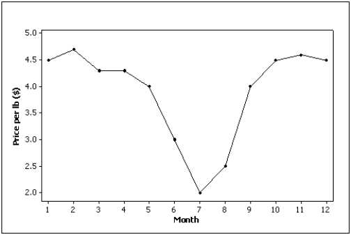
Correct Answer:
Verified
Q5: The sum of cumulative relative frequencies always
Q7: Correlation implies causation.
Q7: Time series data are often graphically depicted
Q16: A modal class is the class with
Q50: The graph below is an example of
Q57: The first scatter diagram below shows a
Q84: If two variables have a strong linear
Q89: The graphical technique used to describe the
Q92: When two variables are linearly related,and tend
Q100: The two most important characteristics to examine
Unlock this Answer For Free Now!
View this answer and more for free by performing one of the following actions

Scan the QR code to install the App and get 2 free unlocks

Unlock quizzes for free by uploading documents