The line chart below shows potato prices per pound for each month from January (month 1) to December last year. By looking at this chart you can see the lowest potato prices occurred in ____________________. 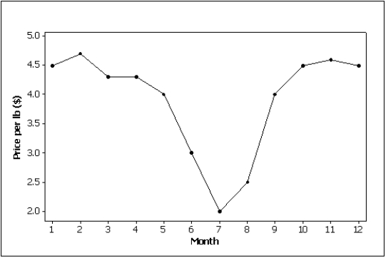
Correct Answer:
Verified
Q21: We create a frequency distribution for interval
Q23: A histogram is said to be _
Q26: A(n)_ is a table that sorts data
Q37: A(n)_ histogram has two peaks,not necessarily equal
Q38: A graph of the frequency distribution for
Q43: The largest value of a cumulative relative
Q57: The length of each line in a
Q63: Time series data are often graphically depicted
Q64: A(n)_ is created by plotting the value
Q110: NARRBEGIN: Home Care
Home Care
Data are collected on
Unlock this Answer For Free Now!
View this answer and more for free by performing one of the following actions

Scan the QR code to install the App and get 2 free unlocks

Unlock quizzes for free by uploading documents