The graph below is the Keeling Curve,a record of carbon dioxide measured at Mauna Loa beginning in 1958.What can be learned from this graph? What do the two lines (black and grey)tell us? 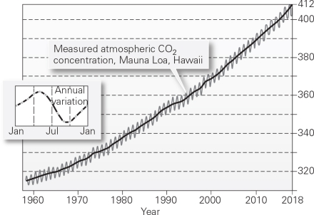
Correct Answer:
Verified
View Answer
Unlock this answer now
Get Access to more Verified Answers free of charge
Q41: According to the figure below,approximately how much
Q42: Some researchers think that _ are causing
Q43: Describe one way humans have impacted the
Q44: The figure below shows changes in sea
Q45: Compare and contrast unidirectional change with cyclic
Q47: blogger writes that global warming is not
Q48: Some researchers have started informally using the
Q49: In the last few decades,global warming has
Q50: What role do greenhouse gases play in
Q51: Models used by the Intergovernmental Panel on
Unlock this Answer For Free Now!
View this answer and more for free by performing one of the following actions

Scan the QR code to install the App and get 2 free unlocks

Unlock quizzes for free by uploading documents