The figure below shows the demand (AD) and supply (SS1) curves of medical care. Figure 32.4 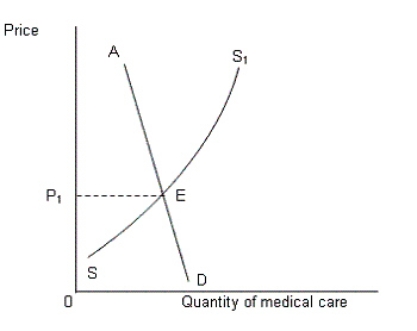 In Figure 32.4, which of the following regions on the graph represents those people who are not willing and able to pay the price P1 for availing medical care?
A) AE
B) SE
C) AD
D) ED
E) ES1
Correct Answer:
Verified
Q41: Why are black markets for human organs
Q47: Why is health care considered to be
Q48: The figure below shows the demand (AD)and
Q48: In the context of the hospitals in
Q49: Which of the following statements is true
Q50: The figure given below represents demand for
Q51: The following figure shows the demand (D)and
Q54: The following figure shows the demand (D)and
Q60: Why does the demand curve for human
Q62: Why didn't the supply of medical care
Unlock this Answer For Free Now!
View this answer and more for free by performing one of the following actions

Scan the QR code to install the App and get 2 free unlocks

Unlock quizzes for free by uploading documents