The following figure shows equilibrium at the industry and firm level. Figure 9.6 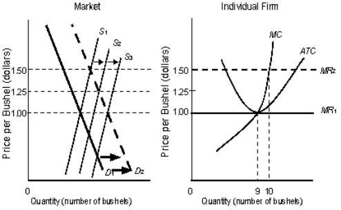 In the figure,
S1, S2, S3 are the market supply curves.
D1 and D2 are the market demand curves.
MC is the marginal cost curve of the firm.
MR1 and MR2 are the marginal revenue curves of the firm.
ATC is the average-total-cost curve of the firm.
According to Figure 9.6, a shift of the S curves in the graph on the left side represents:
A) an increased supply because the firm produces more.
B) an increased supply because more firms are producing.
C) an increased supply resulting from a larger number of customers.
D) an increased supply resulting from a lower demand.
E) an increased supply resulting from a lower price.
Correct Answer:
Verified
Q83: The figure given below shows the revenue
Q87: The following figure shows equilibrium at the
Q89: The following figure shows equilibrium at the
Q89: From a social viewpoint,when price = marginal
Q90: Above-normal profits earned by existing firms in
Q91: The following figure shows equilibrium at the
Q92: The following figure shows equilibrium at the
Q93: The following figure shows equilibrium at the
Q94: One method that firms in many nations
Q95: The figure given below shows the revenue
Unlock this Answer For Free Now!
View this answer and more for free by performing one of the following actions

Scan the QR code to install the App and get 2 free unlocks

Unlock quizzes for free by uploading documents