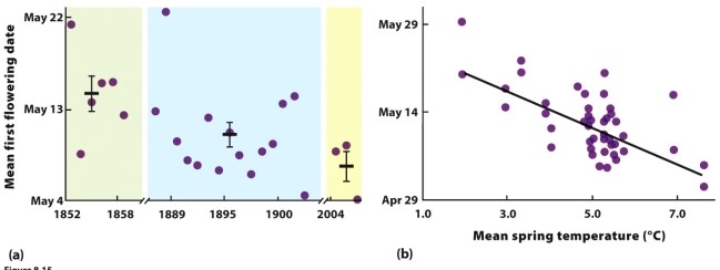
-The data in the figure show a relationship between the mean flowering date for many plant species around Concord, New Hampshire, in the United States, and the mean spring temperature over a time span exceeding 150 years. However, there is a lot of scatter around the best-fit line in panel
b. What information in the chapter might suggest the source of this scatter, and what does it imply about the plant species' cues for flowering?
Correct Answer:
Verified
View Answer
Unlock this answer now
Get Access to more Verified Answers free of charge
Q39: Use this figure to answer questions 21
Q40: For seed-producing trees, what conditions might favour
Q41: Topic: senescence
Difficulty: medium
Across a wide range of
Q42: Topic: the effects of resources
Difficulty: easy
Many animals
Q42: How might population density affect life history?
Q45: Explain how human fishing for larger individuals
Q46: The equation is for a
A) parabola.
B) hypotenuse.
C)
Q48: For some organisms, warmer spring temperatures have
Q53: Many life history events are matched to
Q60: What environmental factor would likely lead to
Unlock this Answer For Free Now!
View this answer and more for free by performing one of the following actions

Scan the QR code to install the App and get 2 free unlocks

Unlock quizzes for free by uploading documents