The graphs show the results of simulations of changes in the frequency of a neutral allele. Each graph shows 10 different runs of the simulation. What is the most likely difference between these simulations? Explain your reasoning. A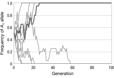
B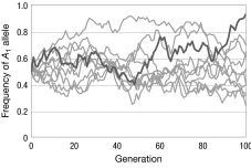
C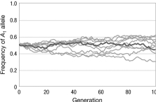
Correct Answer:
Verified
View Answer
Unlock this answer now
Get Access to more Verified Answers free of charge
Q16: If we trace the genealogies of two
Q17: The effective population size is often lower
Q18: Imagine an island archipelago where all of
Q19: Population bottlenecks occur when
A) a large number
Q20: The figure shows the relationship between the
Q22: The solution to the puzzle of why
Q23: Consider a series of island populations each
Q24: A researcher examines a microsatellite locus in
Q25: Consider a population of lizards living on
Q26: Refer to the figure of the
Unlock this Answer For Free Now!
View this answer and more for free by performing one of the following actions

Scan the QR code to install the App and get 2 free unlocks

Unlock quizzes for free by uploading documents