The figure shows the change in allele frequencies over many generations. What differs between the populations represented by the three colors? 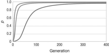
A) the strength of selection
B) whether the allele is dominant or recessive
C) the population size
D) whether selection is frequency dependent or frequency independent
Correct Answer:
Verified
Q6: Stalk height in sunflowers is determined by
Q7: Natural selection can act on both _,
Q8: The table shows the survival and seed
Q9: Consider a locus with two alleles, A
Q10: Consider two events that are mutually exclusive,
Q12: Consider a population that is in Hardy-Weinberg
Q13: Which of the following genotypic fitness values
Q14: Population sex ratios, that is, how many
Q15: Proponents of eugenics sought to eliminate alleles
Q16: What type of selection is demonstrated in
Unlock this Answer For Free Now!
View this answer and more for free by performing one of the following actions

Scan the QR code to install the App and get 2 free unlocks

Unlock quizzes for free by uploading documents