Multiple Choice
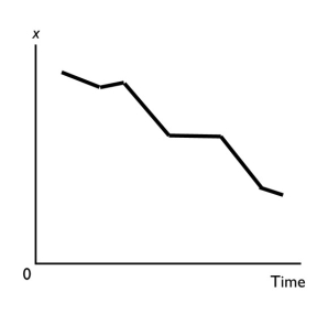
-A graph shows the average wage of various demographic groups in 2012.The kind of graph used to show these data would be a
A) scatter diagram.
B) time-series graph.
C) cross-section graph.
D) Venn diagram.
E) fixed-year figure.
Correct Answer:
Verified
Related Questions
Q164: Q165: Q166: If two variables are positively related,then Q167: A positive relationship exists between two variables Q168: A cross-section graph Unlock this Answer For Free Now! View this answer and more for free by performing one of the following actions Scan the QR code to install the App and get 2 free unlocks Unlock quizzes for free by uploading documents![]()
![]()
A) one
A) is divided into different

