The following table lists some of the busiest ports in the world based on the number of containers in 2010. 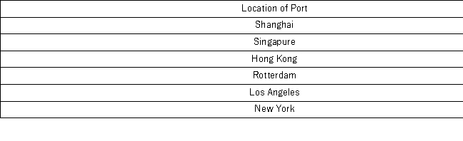 Construct a pie chart to summarize the data.Approximately what percent of the total number of containers go through Hong Kong?
Correct Answer:
Verified
View Answer
Unlock this answer now
Get Access to more Verified Answers free of charge
Q97: For qualitative data, a frequency distribution groups
Q97: Consider the following stem-and-leaf diagram. 
Q99: What type of relationship is indicated in
Q99: What may be revealed from a scatterplot?
A)
Q100: A car dealership created a scatterplot showing
Q102: The dividend yields of the stocks in
Q103: The following table displays the top 40
Q105: The following table shows the prices (in
Q106: The following table shows analyst sentiment ratings
Q113: When constructing a frequency distribution for quantitative
Unlock this Answer For Free Now!
View this answer and more for free by performing one of the following actions

Scan the QR code to install the App and get 2 free unlocks

Unlock quizzes for free by uploading documents