(Figure: Supply and Demand at Home) Suppose the world price is $18, which line in the graph describes the "new" demand curve for the monopolist after a quota of 200 units is imposed?
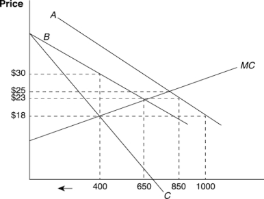
A) A
B) B
C) C
D) MC
Correct Answer:
Verified
Q52: When a country imposes a tariff to
Q53: (Figure: The Home Monopolist's Market) The graph
Q54: (Figure: The Home Monopolist's Market) The graph
Q55: (Figure: Supply and Demand at Home) Which
Q56: How do the deadweight losses of a
Q58: When the home country is small, how
Q59: (Figure: Supply and Demand at Home) With
Q60: (Figure: Supply and Demand at Home) How
Q61: Under the voluntary export restraints, the Japanese
Q62: Under the VER of the 1980s, Japan's
Unlock this Answer For Free Now!
View this answer and more for free by performing one of the following actions

Scan the QR code to install the App and get 2 free unlocks

Unlock quizzes for free by uploading documents