Multiple Choice
What does the data in the chart demonstrate? 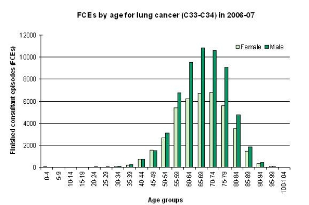
A) The incidence of cancer is highest among women aged 55-59.
B) The incidence of childhood cancer is highest in girls.
C) Cancer affects everyone.
D) A higher incidence of cancer occurs in men across most age groups.
Correct Answer:
Verified
Related Questions
Unlock this Answer For Free Now!
View this answer and more for free by performing one of the following actions

Scan the QR code to install the App and get 2 free unlocks

Unlock quizzes for free by uploading documents