Interpret Information Given by Graphs
The line graph shows the recorded hourly temperatures in degrees Fahrenheit at an airport.
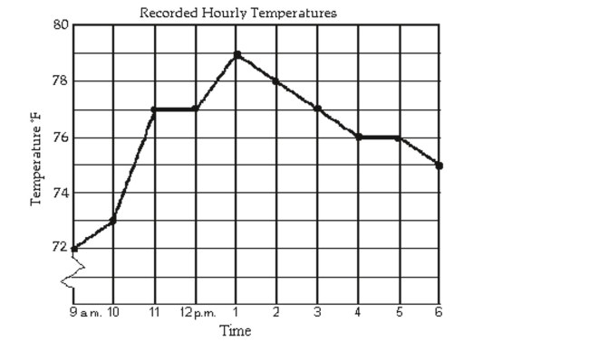
-During which two hour period did the temperature increase the most?
A) 9 a.m. to 11 a.m.
B) 10 a.m. to 11 a.m.
C) 12 p.m. to 2 p.m.
D) 10 a.m. to 12 p.m.
Correct Answer:
Verified
Q31: Interpret Information Given by Graphs
The line graph
Q32: Interpret Information Given by Graphs
The line graph
Q33: Use the graph to determine the x-
Q34: Interpret Information About a Graphing Utility's Viewing
Q35: Use the graph to determine the x-
Q37: Use the graph to determine the x-
Q38: Use the graph to determine the x-
Q39: Interpret Information Given by Graphs
The line graph
Q40: The table of values was generated
Q41: Solve Linear Equations in One Variable
-
Unlock this Answer For Free Now!
View this answer and more for free by performing one of the following actions

Scan the QR code to install the App and get 2 free unlocks

Unlock quizzes for free by uploading documents