The circle graph shows the number of blood donors of the following blood type who participated in the previous blood drive at a community college. Use the following graph. What percent of donors had blood type A+? Round to the nearest tenth of a percent. 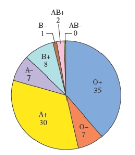
A) 30.1
B) 29.8
C) 33.3 
D) 29.6
E) 30.3
Correct Answer:
Verified
Q8: The circle graph shows the budget allocation
Q9: Suppose that a typical household in
Q10: There are approximately 300,000,000 people living in
Q11: The circle graph shows the budget
Q12: The pictograph below shows the approximate
Q14: The circle graph shows the number
Q15: The circle graph shows the number
Q16: The circle graph shows the number of
Q17: The pictograph below shows the approximate
Q18: The circle graph shows the number
Unlock this Answer For Free Now!
View this answer and more for free by performing one of the following actions

Scan the QR code to install the App and get 2 free unlocks

Unlock quizzes for free by uploading documents