The circle graph shows the number of blood donors of each blood type who participated in the previous blood drive at a community college. What is the ratio of donors with type A- blood to those with type O+ blood? 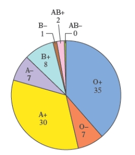
A)
B)
C)
D)
E)
Correct Answer:
Verified
Q10: There are approximately 300,000,000 people living in
Q11: The circle graph shows the budget
Q12: The pictograph below shows the approximate
Q13: The circle graph shows the number
Q14: The circle graph shows the number
Q16: The circle graph shows the number of
Q17: The pictograph below shows the approximate
Q18: The circle graph shows the number
Q19: The pictograph in the following figure gives
Q20: The circle graph shows a breakdown, according
Unlock this Answer For Free Now!
View this answer and more for free by performing one of the following actions

Scan the QR code to install the App and get 2 free unlocks

Unlock quizzes for free by uploading documents