The following graph shows the average donation for different age groups during a fund raiser at Cloverdale Academy. Which age group pair showed the most increase? 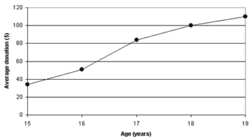
A) From the 15 to the 16 year-olds
B) From the 16 to the 17 year-olds
C) From the 17 to the 18 year-olds
D) From the 18 to the 19 year-olds
Correct Answer:
Verified
Q172: Find the mean for each list
Q173: Find the mean for each list
Q174: Find the mean for each list
Q175: Find the weighted mean for each of
Q176: Find the weighted mean for each of
Q177: Find the median for each list
Q178: Find the median for each list
Q179: Find the mode or modes for each
Q180: Find the mode or modes for each
Q181: The middle number in a group of
Unlock this Answer For Free Now!
View this answer and more for free by performing one of the following actions

Scan the QR code to install the App and get 2 free unlocks

Unlock quizzes for free by uploading documents