The diagram below shows alternate paths for two hypothetical economies,each starting with GDP of $1 billion.Assume that Area 1 is equal to Area 2. 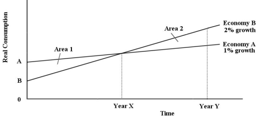 FIGURE 25-1 Refer to Figure 25-1.The area marked Area 1 represents
A) the value of consumption from Year 0 to Year X in Economy A.
B) the value of the investment in capital goods undertaken by Economy B.
C) the value of the investment in capital goods undertaken by Economy A.
D) the sacrifice of current consumption by Economy B,as compared to Economy A.
E) the sacrifice of current consumption by Economy A,as compared to Economy B.
Correct Answer:
Verified
Q4: The diagram below shows alternate paths for
Q5: Suppose per capita GDP in a richer
Q6: Which of the following is implied by
Q7: If real income grows at approximately 4%
Q8: The diagram below shows alternate paths for
Q10: If real income grows at approximately 2%
Q11: Consider the following table for a hypothetical
Q12: Between the years 1960 and 2017,the Canadian
Q13: Suppose GDP in a richer country is
Q14: Which of the following is a common
Unlock this Answer For Free Now!
View this answer and more for free by performing one of the following actions

Scan the QR code to install the App and get 2 free unlocks

Unlock quizzes for free by uploading documents