The following graph shows average fixed costs, average variable costs, average total costs, and marginal costs of production. 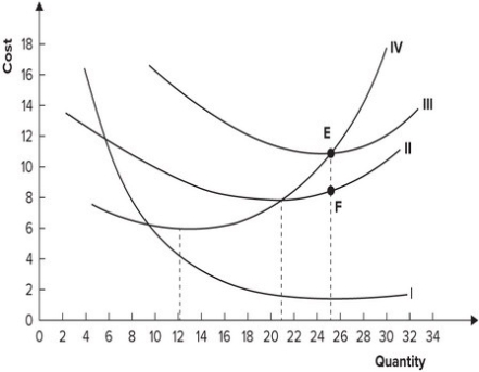 Why does the distance between curves II and III get smaller as quantity increases?
A) Marginal cost is increasing.
B) Average variable cost is increasing.
C) Average fixed cost is declining.
D) Average fixed cost is increasing.
Correct Answer:
Verified
Q101: The following graph shows average fixed costs,
Q102: Refer to the table shown. The
Q103: Refer to the table shown. The
Q104: The average fixed cost curve is:
A) U-shaped.
B)
Q105: If a firm's average fixed cost is
Q107: The following graph shows average fixed costs,
Q108: The following graph shows average fixed costs,
Q109: If output changes by 10 units while
Q110: Refer to the table shown. The
Q111: The following graph shows average fixed costs,
Unlock this Answer For Free Now!
View this answer and more for free by performing one of the following actions

Scan the QR code to install the App and get 2 free unlocks

Unlock quizzes for free by uploading documents