Which curve shown below represents the market supply given the following individual supply tables? 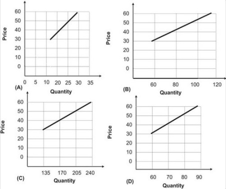
A) A
B) B
C) C
D) D
Correct Answer:
Verified
Q81: Given the graph shown, the quantity that
Q82: When the wage rate paid to labor
Q83: Suppose a market has an excess demand
Q84: The following graph shows the supply of
Q85: The following graph shows the supply of
Q87: If the price in a market is
Q88: When the going rate is $10.00 per
Q89: The following graph shows the supply of
Q90: Which of the following would be expected
Q91: Refer to the graph shown. Suppose that
Unlock this Answer For Free Now!
View this answer and more for free by performing one of the following actions

Scan the QR code to install the App and get 2 free unlocks

Unlock quizzes for free by uploading documents