The figure given below represents the effects in the labor markets due to migration. Here the world has been divided into a high-income "North" (left panel) and a low-income "South" (right panel) . Dn and Sn are the labor demand and the labor supply curves in North. Ds and (Sr + Smig) are the labor demand and pre-migration labor supply curves in South. Sr is the post-migration labor supply curve in South. The value c is the cost of migrating. 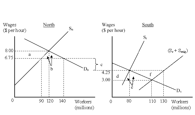 After migration of the workers, the workers in North earn _____ per hour and South workers earn _____ per hour.
A) $6.75; $4.25
B) $8.00; $4.25
C) $6.75; $3.00
D) $8.00; $3.00
Correct Answer:
Verified
Q30: Which of the following was among the
Q31: Which of the following is most likely
Q32: The figure given below represents the effects
Q33: The figure given below represents the effects
Q34: Which of the following groups are negatively
Q36: If movement of labor across countries is
Q37: As some government spending is for true
Q38: In the case in which foreign affiliates
Q39: The figure given below represents the effects
Q40: China's economic growth and emergence as a
Unlock this Answer For Free Now!
View this answer and more for free by performing one of the following actions

Scan the QR code to install the App and get 2 free unlocks

Unlock quizzes for free by uploading documents