The following bar graph presents the average amount a certain family spent, in dollars, on various food categories in a recent year.
On which food category was the most money spent?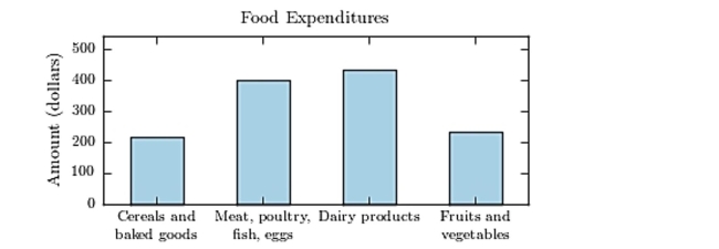
A) Cereals and baked goods
B) Dairy products
C) Fruits and vegetables
D) Meat poultry, fish, eggs
Correct Answer:
Verified
Q7: Classify the histogram as unimodal or bimodal.
Q8: The following frequency distribution presents the
Q9: The following table presents the purchase
Q10: The following frequency distribution presents the
Q11: The following frequency distribution presents the
Q13: The following frequency distribution presents the
Q14: One hundred students are shown an eight-digit
Q15: The following frequency distribution presents the
Q16: The following frequency distribution presents the
Q17: The following table presents the purchase
Unlock this Answer For Free Now!
View this answer and more for free by performing one of the following actions

Scan the QR code to install the App and get 2 free unlocks

Unlock quizzes for free by uploading documents