The following histogram shows average SO2 (sulfur dioxide) boiler emission rates from selected utility companies. The data was collected from a voluntary response sample of utility companies. Does the distribution depicted in the histogram reflect the true distribution of the population? Why or why not? 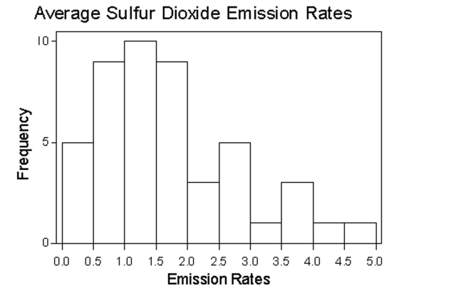
Correct Answer:
Verified
View Answer
Unlock this answer now
Get Access to more Verified Answers free of charge
Q1: Provide an appropriate response.
-Histograms and Pareto charts
Q10: Provide an appropriate response.
-Create an example displaying
Q14: In a survey, 26 voters were
Q15: Suppose that a histogram is constructed
Q16: One purpose of displaying data graphically
Q18: An airline checked 7 of its flights
Q21: Use the given data to construct
Q23: Use the given data to construct
Q24: The graph below shows the average cost
Q54: Describe at least two advantages to using
Unlock this Answer For Free Now!
View this answer and more for free by performing one of the following actions

Scan the QR code to install the App and get 2 free unlocks

Unlock quizzes for free by uploading documents